Production (for geeks only)
"Rock Around The World" was
half old-school paste-up, half new-school snazzy database and desktop publishing.
The magazine consisted of 30–40-pages, was 8.5 x 11 in size, and was printed on newsprint paper bound with glue. 10,000 were printed each month.
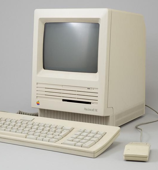
I produced most of it on my very first personal computer – the trusty Apple Macintosh SE that I got a few years earlier while still in college. Complete with 1 MG of memory! A built-in operating system (instead of having to use a separate floppy disk)! And a teeny tiny little screen that didn’t seem so little at the time. Cutting edge!
For page layout, I used a program called “Publish It” which was very similar in functionality to Quark Xpress, which I would easily learn later at my first adult job, when I was hired at a commercial printer.
I couldn’t scan and place images yet (the technology just wasn't there) so I had to leave blank spaces in the document where an image would ultimately be physically pasted onto a laser printer printout.
In Publish It, I would typeset and layout the text for interviews, live show reviews, and some of the ads. Any time text or band listings would flow onto another page, I had to type “continued on next page” in a separate document, very carefully cut it out, and manually place it on the paste-up board using an Exacto knife.
For photos, it seemed everyone in town who had anything to do with the underground music world, graphically-speaking, (especially anyone who did those telephone posters) went to this one machine at Clean Copy, a local quick print shop downtown near Portland State University. This one machine had the ability to print out half-tones of photos. (A half-tone takes a continuous tone image – such as a photo – and converts it into dots. For printing on newsprint, 85 dots per inch was needed. Smaller dots (such as 150 dpi) work well for fancy high gloss magazines but would’ve created a muddy-looking image on very porous newsprint paper.) These half-tone prints were then cut out and pasted on the page.
For the collection and layout of band listings, I was very blessed. My then boyfriend had a longtime friend who worked at Apple Computer and she custom-built just for me a fantastic database using Apple’s
HyperCard
program. She called it “Bandstacks”. Click
here
to see her documentation. (After recently re-reading the documentation, she wrote me this: omg the lengths we had to go to for every effing thing back in those primitive times...)
It was buggy at first. I remember many a frantic call to Peter (yes, that’s her name) needing major tech support right before going to print, usually waking a very grumpy version of her at 1:00 in the afternoon (as she kept very different hours than me!). But she was a brilliant godsend. There is NO WAY I could’ve produced this magazine without her database.
Data entry was effortless. And with one click of a button, everything was automatically sorted alphabetically by band; another button and everything was sorted by country, state, and city. Beautiful!
Once all the data had been entered and sorted into a “print ready” layout, I would throw it on a floppy disk and head down to Kinko’s Copies (now FedEx Office) to get everything printed on their very impressive laser printer. Back then, it was too expensive for individuals to own laser printers. The only semi-affordable personal printer at the time was the dot matrix: very low resolution, visible dots that left everything with rough edges, not appropriate even for newsprint printing!
For advertising, I designed and created some of the ads for the advertisers in “Publish It” but received most of the ads from record labels or directly from the bands. They would send them “print ready” so I could just paste them onto the layout sheets.
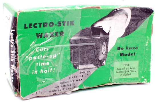
When pasting the printed pieces down on the art boards, everything had to placed perfectly straight and perfectly spaced from other items – which meant a lot of peeling off and trying again! Instead of using actual paste, glue or even rubber cement, I used a really nifty wax roller machine.
Mine was the small, hand-held variety. Commercial printers used a much bigger version where you’d stick the printed pieces into a sheet-fed roller. With mine, I’d do the rolling across the back of each piece. The beeswax was placed in the main body of the roller and took about about 30 minutes to warm up. Rolling was easy and no fuss. The wax remained “sticky” through many peel-offs and re-placements.
In order for each page to end up in correct numeric order once folded and bound, I had to do my own collation. The printer was Pry Publishing in the Pearl District in Portland – back when the Pearl District was still mostly industry and warehouses, not the swanky silly expensive chic place it is today. They provided me with full-sized, 4up and 8up layout sheets along with an "imposition guide" showing where I had to put each page. It was convoluted and confusing! For my sanity, I always created a tiny, penciled-in, folded mockup of the whole zine so I knew what was going on each page and could paste down appropriately.
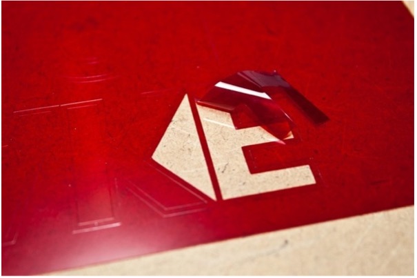
(image from rittagraf.com)
In an effort to save money, the only color appeared on the front and back covers (with one exception in the December issue – the Great North American Alternative Record Store Map! – whose pages were on the same 8up spread as the covers). And to create the color layer? Rubylith!
Rubylith was masking film that had two-layers built into it (one layer a deep red and the other clear). Using an Exacto blade knife, I had to carefully trace around whatever areas I wanted to have color. Those were left red. The rest had to be carefully peeled away to the clear layer. The Rubylith layer was then taped over the black and white layer in the exact location the color would go. It took very exacting cuts and could be easily messed up! And I needed to leave just enough overlap (called “trapping” in the print world) so that no white gaps would appear where the color butted up against the black and white, in case the paper shifted during printing. Luckily I knew what trapping was and how to do that from my years of running various small presses before doing RATW.
The two layers (the black & white and the rubylith color) were given to the printer who used a giant camera to make giant negatives that were developed and placed on a metal plate, one for each color, exposing them to UV light so the image would appear on the plate. The plates were wrapped around a large drum of a printing press where the ink would adhere to the image bits on the metal plate wrapped around the drum, transferring the image onto the newsprint paper.
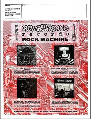
I look at the color separation on some of the back covers and think, “How did I do that?? Look at all those tiny details!” I’ll bet the record label sent me those ads with the Rubylith layers already cut out so its color break was “camera-ready”. What hell that would’ve been trying to cut out all those details!
Today, nothing would be done by hand. It would all be done on a computer, and probably live in the cloud. No thinking required on the part of the designer or layout artist about registration marks, color separation, trapping, collation, everything! It’s all done automatically and digitally. When I did RATW, it was the transition era of moving into the digital, the rest done by hand. Kinda fun, frankly! The kids these days, they don’t know what they’re missing!
Previous: RATW Origin Story
Next: RATW Issue 01